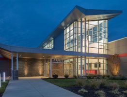
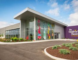
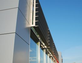
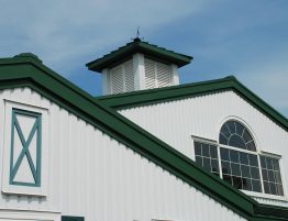
The greatest obstacle and design challenge was to incorporate the existing clinic into the new design. The building was originally built as a telephone switching station and was designed for utility, not aesthetics. The flat concrete slab roof and masonry exterior bearing walls made this a very simple and unimpressive looking building. By putting on a new gabled roof, new enlarged windows, and new exterior materials, we were able to successfully transform the structure and integrate it into the design of the new addition.
The design of the site presented many difficulties due to its close proximity to Fowlers Creek that collects storm water runoff from newly developing properties in the area. Due to its rural location, no flood maps were developed for this part of the Union, Kentucky therefore, detailed studies were made and submitted to FEMA to determine the flood plain elevation and confirm that the addition could successfully be built on the site.
Once the base flood elevation was determined, the site design needed to take into account not only flooding concerns but strategies to best utilize the site from a vehicular traffic flow and client access point of view. Due to the shape of the property, the logical choice for the new addition was on the north part of the site. This location created the best visibility for the building as you approached from a car and allowed client parking to be placed next to the main entrance. The new vehicular entrance and parking lot then continued around the back of the facility to connect to the existing parking lot that is not used for employee parking and general deliveries. The floor elevation between the existing and new addition was designed to be the same so that there would be a seamless transition between the two. The existing building now serves as employee-only spaces that could be converted at a later date into patient care areas.
Union Pet Clinic

